- The paper reveals 42 distinct design patterns from analyzing 144 dashboards, categorizing them into content and composition elements.
- Key methodology involves systematic analysis of data presentation, visual representation, and interaction techniques to balance screenspace and information detail.
- Practical implications include a toolkit that guides designers to optimize dashboard layouts and interactivity, enhancing user experience and decision-making.
Understanding Dashboard Design Patterns
This paper, "Dashboard Design Patterns," thoroughly examines the patterns used in the development of dashboards, providing both a systematic framework and practical insights into dashboard design. The authors analyze 144 dashboards to identify 42 design patterns categorized into two main groups: Content and Composition. These patterns serve as a toolkit to inform and streamline the dashboard design process, catering to varied user needs, tasks, and contexts.
Content Design Patterns
Data Information patterns concern the types and levels of data abstraction present in a dashboard. This includes detailed datasets, aggregated data, and derived values, which are essential for conveying complex information efficiently. A common usage is the presentation of detailed data sets (94%), allowing users to explore comprehensive data views, while aggregation (67%) offers summary views for swift insights. Derived values (69%) add context by emphasizing trends or summaries.
Meta Information patterns provide the contextual or supplementary data often not explicitly available in raw datasets. This includes data sources, disclaimers, update timestamps, and annotations. This meta-information is crucial for users to comprehend the scope and reliability of the data presented.
Visual Representation
Various visual representations are employed to reflect the level of data abstraction. These range from detailed tables and visualizations, which provide specific data points, to miniature charts and gauges that offer high-level overviews. These visual elements utilize space efficiently and cater to quick data interpretation (Figure 1).
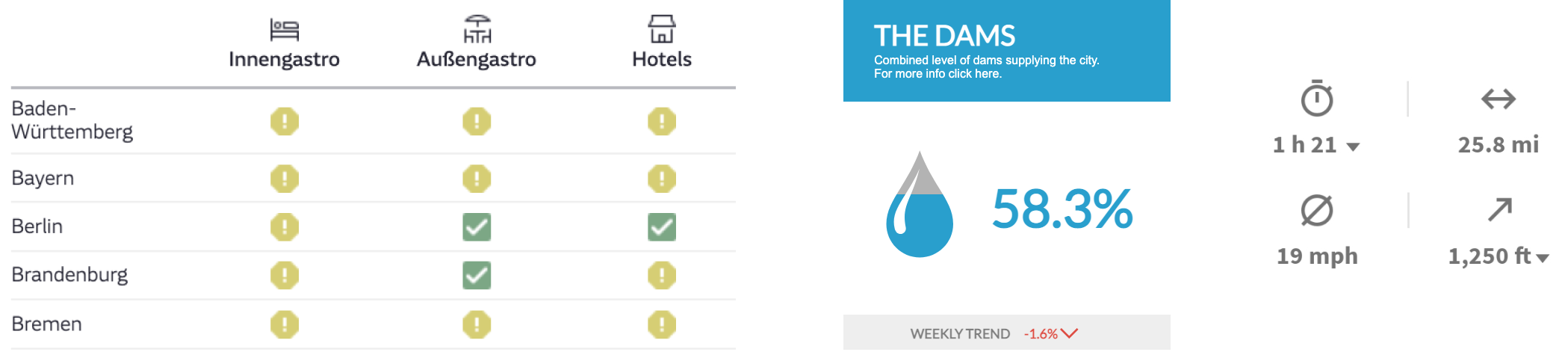
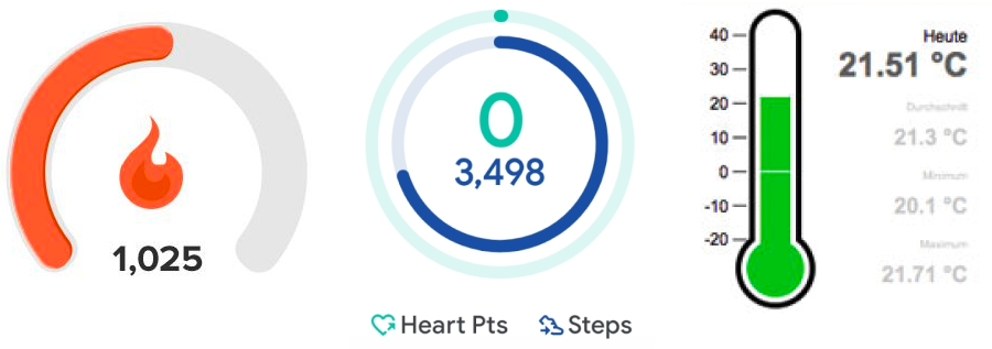
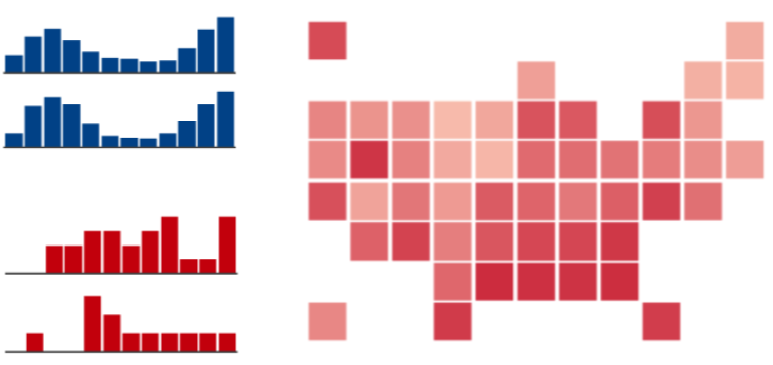
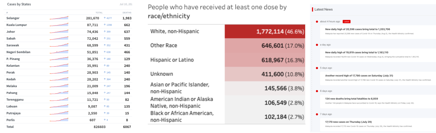
Figure 1: Examples of visual language used in dashboard to show data.
Composition Design Patterns
Page Layout
Page layout patterns determine the arrangement and prioritization of dashboard components. Layouts can be open, stratified, grouped, schematic, or table-based, each offering varying emphasis and visualization density. Stratified layouts, for example, present data hierarchically, placing the most critical information at the top for immediate access (Figure 2).
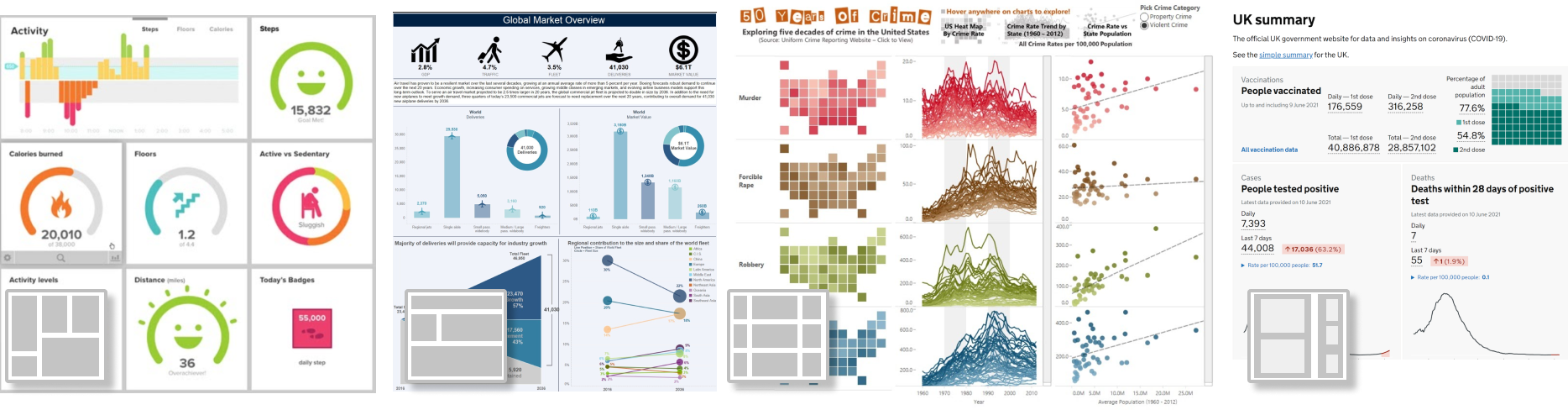
Figure 2: Examples of different dashboard page layouts: open #19, stratified #11, table #5, grouped #88.
Screenspace
Screenspace patterns address how dashboards fit content within the available display area. Techniques include screenfit—where all content remains visible without scrolling—and overflow, allowing larger-than-screen displays navigable via scroll. Detail on demand and parameterization provide interactivity by revealing additional data as needed, minimizing upfront information load.
Interaction
Interactions drive dashboard interactivity, facilitating exploration, drill-down, navigation, and personalization. Empowering users to adjust data views and access detailed insights dynamically reduces cognitive load and enhances data-driven decision-making capabilities.
Dashboard Genres
The research identifies six dashboard genres: Static, Analytic, Magazine, Infographic, Repository, and Embedded Mini dashboards. These genres represent common combinations of design patterns, oriented towards specific user contexts and tasks. Infographic dashboards, for example, seamlessly incorporate decorative and descriptive elements to tell a data story vividly (Figure 3).
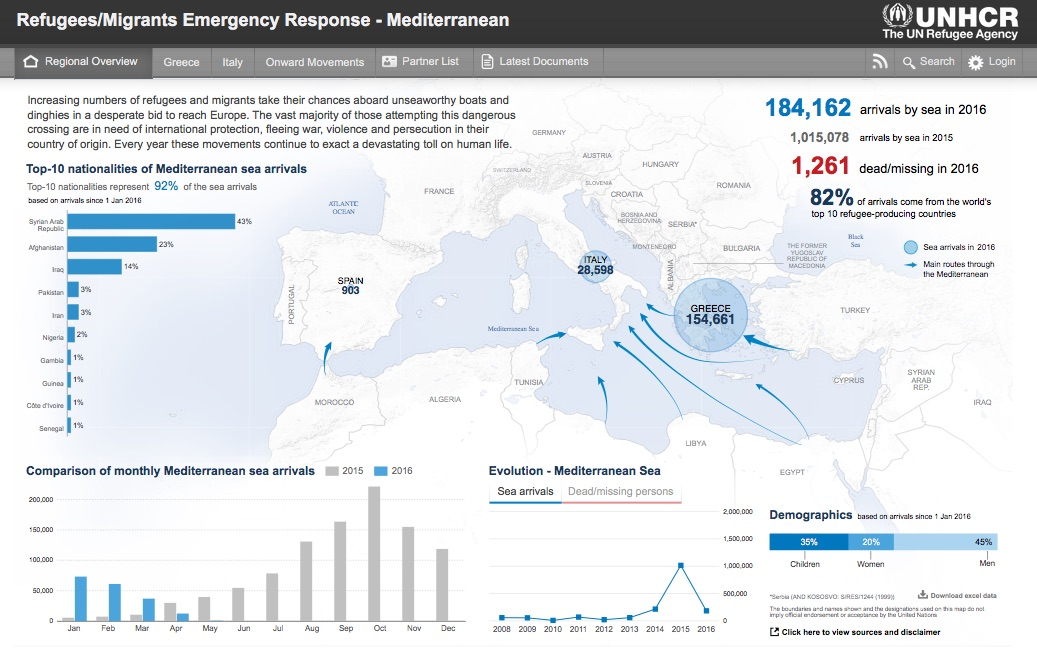
Figure 3: Example of an infographic style dashboard (#74).
Design Tradeoffs
One of the critical challenges in dashboard design is balancing various tradeoffs—between screenspace, data abstraction, interaction level, and page number—to optimize user experience. The authors propose a model illustrating how varying these parameters affects the overall dashboard design, emphasizing the significance of thoughtful pattern application (Figure 4).

Figure 4: A simplified model for design tradeoffs in dashboard design. Reducing one of the parameters (screenspace, abstraction, number of pages, interaction) requires an increase in one or multiple of the other parameters.
Conclusion
The study of dashboard design patterns furnishes designers with a structure to guide the creation of effective dashboards. By leveraging these patterns, designers can decisively balance complex data presentation requirements with user interaction capabilities, ensuring dashboards remain accessible, efficient, and informative. As the utilization of dashboards expands, continued exploration and codification of design patterns will support the evolving demand for diverse, user-centered visualization tools.